The Role of Color Psychology in Web Design: Creating Impactful User Experiences
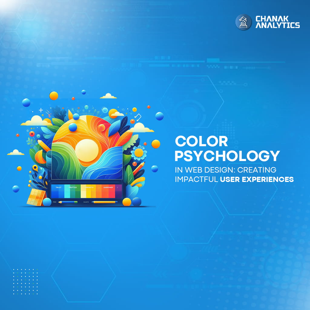
Colour psychology is a crucial technique that a designer can employ to create a website that visitors will remember. Colours are more than simply attractive pixels. They define moods and shape user behaviour. Let’s discuss colour psychology in web design right away!
Imagine your favourite brand palette as a superpower, purposefully guiding visitors through your site. Each colour conveys a message: blue stands for reliability, red for excitement, and green for growth. You can influence the user experience from start to finish by creating successful colour meanings.
In the world of website design, colours aren’t chosen randomly. They serve as tools for a brand’s strategic socialisation and emotional connection with users. So, the next time you’re creating a website, remember the power of colour—it’s so much more than meets the eye!
Colour Power: Shaping User Experiences
Web design colours are not just pretty pixels but powerful tools to determine users’ feelings and behaviour. Here’s a glimpse into how colour psychology transforms user experiences:
- Emotional Connection: Colours communicate feelings. Red and orange tones create excitement, while cool shades like blue and green create a sensation of peace.
- Brand Identity: Your cool brand palette is not just a visual show-off; that’s your visual voice. Colours are used consistently to reinforce brand recognition and trust.
- Visual Hierarchy: Strategic colour selection guides users via your site, drawing attention to more significant elements and action prompts.
- Accessibility: Consider colour contrast for readability so that all users can effortlessly navigate your site.
- Cultural Significance: Colours convey cultural symbols. Know your audience to prevent inadvertent misinterpretations.
With the assistance of colour psychology, a plain website design can be transformed into an exciting, impressionable platform. Implement these ideas today!
Unlocking Colour Secrets: The Psychology of Hues
Colours are extremely important in web design because they heavily influence the user experience. Accurate knowledge of colour psychology aids in the massive development of websites. It also has a positive impact on visitors. Here’s the breakdown:
• The Impact of Colour Tones
- Warm Colours: Red, purple, and orange are warmer colours that evoke and enhance sensations of energy and passion. They can promote a call to action or create a sense of urgency.
- Cool Colours: Blue, green, and violet tones convey tranquillity and dependability. They are used to induce calmness or boost credibility.
• Website Design and its Effects:
- Background: Unlike other sorts of backdrops, neutral colours such as white or light grey have distinct characteristics. It provides a clean canvas with fully readable content.
- Text: Unlike neon or fluorescent lighting, which is bad for the eyes, black or dark grey text on a light background optically enhances readability and accessibility.
- Accents: Streaks of colour are okay, but they should be used sparingly. It should not confuse the user.
• Colour Combinations for the Website:
- Analogous: The hues that are side by side on the wheel of colours generate a unified and harmonic image.
- Complementary: The colour combination of hues opposite each other on the wheel generates a universe of contrast that draws attention.
Colour psychology will allow web designers to create websites that are more than just visually appealing. They would have the ability to communicate with customers more effectively.
Transforming Web Design with Colour Psychology
Colour psychology is a prime focus in web design as it affects the way users perceive and act. Through proper implementation of colours, designers can craft visually appealing websites that connect with users on a deeper level.
- Understanding Colour Associations: Colours evoke certain key emotions in users. Colours such as blue would indicate intimate trustworthiness and professionalism. Whereas passion and urgency can be symbolised by the red colour.
- Creating Visual Hierarchy: It can direct users’ eyes to certain elements, thus making them noticeable on the web page. The luminous, bright, and dark contrasting colours attract the eyes, while the mutation of the tones creates feelings of harmony.
- Building Brand Identity: Complementary colours form the links that form a cohesive brand, and customers will remember a website because of it. There is the development of trust and the acquisition of more loyal customers over time.
- Improving User Engagement: Impressions can be boosted by the help of colours, for example, by the production of a homely setting or otherwise raising people’s curiosity. Warm colours like orange and yellow can stimulate strong sensations, whereas cool colours like mint and indigo can provide a sense of relaxation.
- Adapting to Cultural Differences: Different cultures associate colours in different ways. It is becoming an increasingly important thing to consider while planning globally. For example, white in Western cultures is associated with purity, while in some other Eastern cultures, the white colour might be an indication of grief.
Mastering Website Branding with Color Psychology
By knowing how emotional reactions to colours arise, businesses can use the best colours to evoke specific messages or change their customers’ behaviour subconsciously.
- Establish Brand Identity: Colours can help shape a brand’s visual identity by portraying its character and important points. Green, for example, might represent trust, professionalism, and nature, as opposed to growth.
- Affecting User Perception: Colours shape a user’s perception. It helps a website appear to be legitimate, user-friendly, and visually appealing. Warm colours, like red and orange, are associated with urgency and enthusiasm, whereas cold colours, like blue and green, are associated with relaxation and calmness.
- Guiding the User Journey: Strategic use of colour can help guide viewers around a website by drawing their attention to crucial components such as call-to-action buttons or a navigation menu.
- Enhancing Visual Hierarchy: When different colour contrasts are used, it makes it easier for users to navigate and prioritise website content.
Unlocking the Power of Color in Design
The role of colour in web design cannot be underestimated, as it provides more than just elegance. Not only can it affect the way the users feel, but it can also determine the way they interact with it. Here’s why it matters:
- First Impressions: Colours are more likely to be noticed by consumers than anything else. This sets the tone for their experience. Brighter hues always lift the mood, while the calmest tints provide a sense of trust and expertise.
- Brand Identity: The use of consistent colour schemes strengthens brand identity. Moreover, your website will stand out, looking professional, and thus, your customers will not forget about it. A red Coca-Cola bottle or a blue Facebook—the colour is so closely identified with the brand that a single look is enough.
- Emotional Connection: Each colour serves a unique purpose in evoking emotions. Warmer colours, such as red and orange, provide the impression that people are excited when they glance at these buttons. However, focusing on cool tones, notably blue and green, will have a relaxing and trusting effect.
- Accessibility: The selection of colour schemes affects user accessibility, particularly for people with vision problems. Textual parts in high contrast against the background colours guarantee better readability for visitors to the site.
- Visual Hierarchy: A trendy and creative use of colours can act as your right arm. It will bring users to different parts of your website by illuminating essential elements and descriptions.
Want to Make Your Website Pop? Learn These Color Tricks
Colour is the key factor in web design, which determines the user’s experience and how they perceive the website. When designing a website for a company, consider these best practices:
- Understand Your Audience: Various colours are linked with different feelings. Get to know your target audience and select the colours that suit them the best.
- Consistency is key. Always keep a uniform colour scheme throughout your website to ensure brand identity and create simpler navigation.
- Accessibility Matters: Make sure that your colours suit users with visual impairments. Enhance the visibility by increasing the contrast between the text and the background colours.
- Highlight Call-to-Actions: Highlight the main buttons or links with bright colours to direct the users’ actions.
- Avoid colour overload: Too many colours can be disturbing to visitors. Keep it uncomplicated and use the colours wisely to make the viewer focus on the right place.
- Consider Cultural Significance: Be aware of the cultural meanings of colour, particularly if your website design is for a worldwide audience.
- Embrace Black: Although sometimes black is ignored, it can be used to provide sophistication and contrast in the design of your company’s website. Adopt it for text, backgrounds, or accents to create a sophisticated and contemporary appearance.
With the use of these colour principles, you can enhance your website’s design and make it more interesting for users.
Struggling with Color Choices for Your Website? Here’s Your Solution
In the lively world of web design, colours have a lot to say. Picking the correct colours is not only about aesthetics; it is also about creating an experience that users will remember. Here’s how you can nail it:
- Colour Picker Tools: Websites like Coolors and Adobe Colour give you an easy way to choose colours that go well together.
- Colour Psychology: Grasp the feelings that are related to different colours. For instance, blue means trust and professionalism, and yellow is the symbol of energy and the feeling of optimism.
- Contrast Checkers: Services like WebAIM’s Contrast Checker guarantee that your colour combinations are accessible to all users, especially those with visual impairments.
- User Testing: Try out different colour schemes and get feedback from the users to know which one is the best for your target audience.
- Inspiration from Black Websites: Delve into sleek and stylish black websites to get ideas on how to use dark backgrounds effectively for web design.
Through the use of these tools and information, you can design amazing and attractive websites with the best colour schemes.
Ever Wondered How Color Choices Transform Websites?
• Coca-Cola: Classic Red
The famous red Coke is a symbol of the excitement and energy that make you want to drink it.
• Amazon: Trusty Blue
The blue colour of Amazon creates a sense of calmness and instils trust and reliability, which makes you feel comfortable when shopping.
• Nike: Bold Black
The very black design of Nike’s website gives the impression of sophistication and power, which thus calls for action.
• Swiggy: Vibrant Orange
Active orange sparks in Swiggy’s advertisement make you hungry and excited; hence, you are tempted to order.
• Google: Cheerful Multicolor
The colourful and playful multicolour palette of Google is a symbol of diversity and innovation.
These brands brilliantly use colour psychology to catch the attention of the audience and make the online experience unforgettable. So, next time you design a website, remember: it is all about the colours and not the words.
Can Color Psychology Transform User Experiences?
Colour psychology is a powerful tool to boost your website’s impact. Good colour combinations for websites are not only visually appealing; they can also bring out feelings, control actions, and improve the user experience. Today’s websites are based on colour schemes, which make the sites attractive and users’ navigation very smooth. Enterprises such as Flipkart and Zomato are the masters of this game, as they skillfully use colours to get in touch with their targets. Do not forget that colours convey more than words online. Select the appropriate move to express your brand’s personality, create the right feelings, and make a memorable impression. Using colour psychology as your helper, you can design digital experiences that attract and connect with your users, thus increasing engagement and creating brand loyalty.
Join the community
Join our 400,000+ person community and contribute to a more private and decentralized internet. Start for free.